Radar charts are often overlooked when it comes to dashboards and analytics but I’ve recently fallen in love with them again and here’s why you should too…
Radar charts have been around in Qlikview for a long time but I never really made use of them. They fell completely out of my mind after I made the move to Qlik Sense, what with it not being a native chart option. After all, what is a radar chart if not a circular bar chart? At first glance, with a single measurement, radars make it harder to compare the height of lines and bars than conventional line and bar charts.
My opinion started to change when, for my sins, I got back into playing the game Football Manager (if you’re into sport and data there isn’t really a better way to kill a few hours). The game uses a few different charts to present key information such as club finances and player development but, a tool I kept coming back to was a radar chart for comparing 2 different player’s stats.
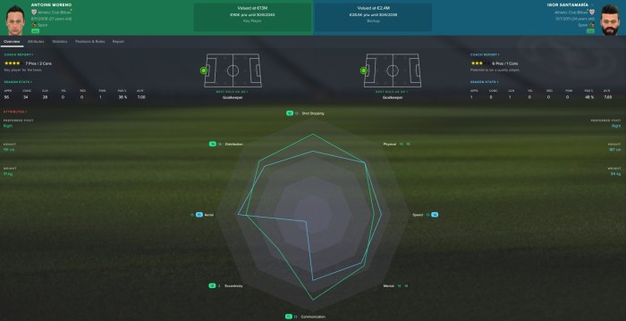
The above radar chart allows me to compare players in key areas of their game but the real beauty of the chart is that it also lets me compare them as a whole. A player whose data points lie mostly within the other players is likely to poorer as a footballer on the whole. This is something that would be hard to gleam from a bar chart without having to add a “total” bar to the end (which is not often done as it skews the Y-axis).
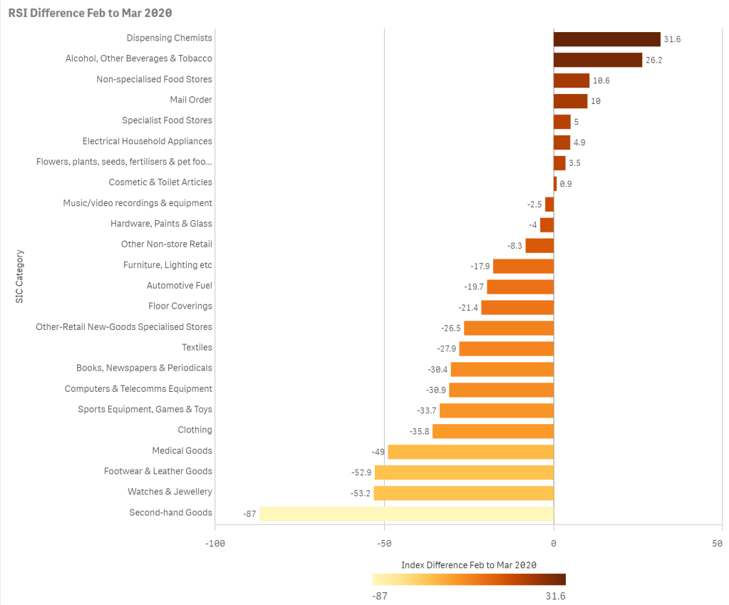
I recently conducted a piece of analysis on ONS retail data to understand which retail sectors were suffering during covid-19 lockdown. Taking 2 months data (before and during lockdown) I plotted the data out as a bar chart showing the difference between months. It did a job and told a story.
However, with the Football Manager radar chart in my mind, I decided to see what it would look like as a radar.
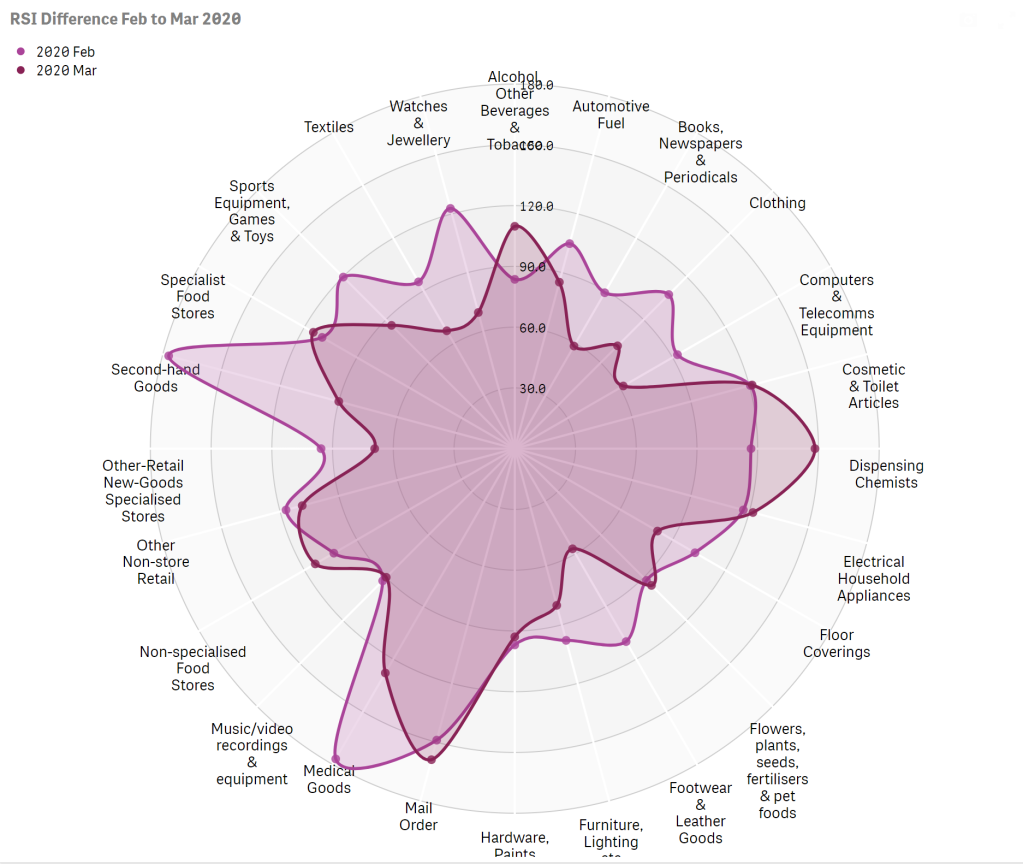
This presented a striking story. Not only could I see which sectors were doing better/worse (like the bar chart), I could clearly see the contraction of the whole retail sector.
So next time you need to make comparisons in your data, keep the radar chart in mind. I definitely will.
Notes:
Thank you to Brian Booden and Matthieu Burel for developing the extension and getting it to this point. It’s a massively welcome addition to the out-of-the-box Qlik Sense product.
The Qlik Sense radar chart can be found in the Visualisation bundle (extensions). Whilst it looks great there are a few tweaks I’d like to see in future. 1. is on the placing and width of data labels, which if long can overlap eachother. 2. is to add advanced colouring options for finer control of colours, especially for those using a dashboard colour scheme. 3 lastly the value labeling caused me a few issues. If the value was not displayed to at least one decimal point the chart added a comma which made the values which were in hundreds look like they were in thousands.
