There are plenty of Covid-19 dashboards out there (which is doing wonders for data literacy) but something caught my interest the other day when I was looking for my hometown of Sunderland in the government’s data. I was surprised to see the city in its elevated position in the ranked table of cases by upper tier local authority. The narrative we usually hear is that highly and densely populated regions are worst hit but there was Sunderland, above its larger neighbour, Newcastle.
I decided to scrape the data and then use Qlik’s associative engine to compare it with population data from data.gov.uk. For tips on working with geographic data on different administrative regions, KML files and more see the end of this article.
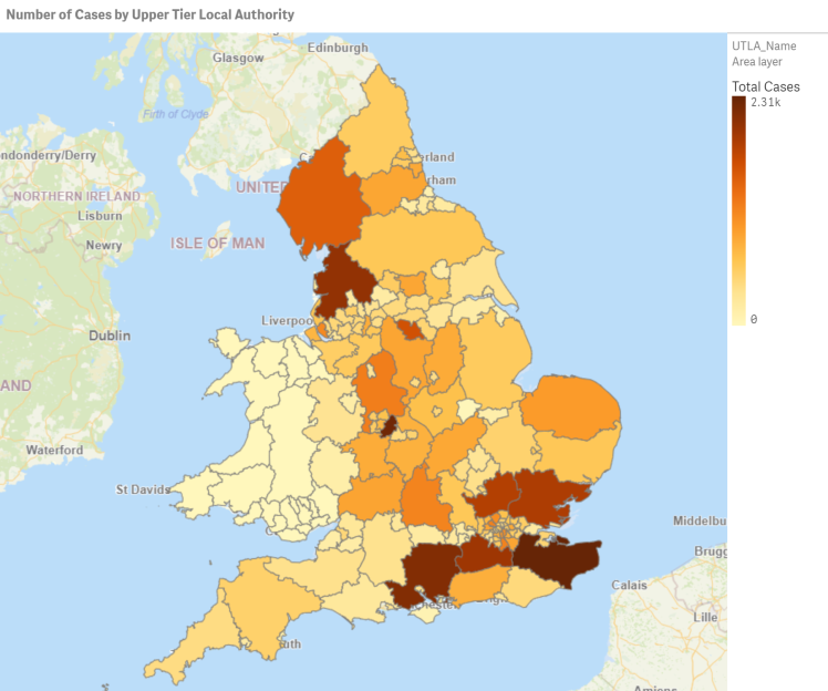
The obvious way to display geographic data is in a map. Here’s the number of cases by upper tier local authority (UTLA).
Let’s compare this to the number of cases as a percent of the UTLA’s population:
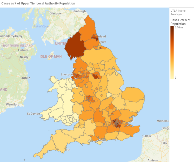
The picture changes quite significantly, especially in North vs South. This tells us that the simple story of Covid-19 taking hold in high population areas isn’t quite as straightforward.
The best way to compare two different metrics is in a scatter chart so let’s convert these maps to a single scatter:
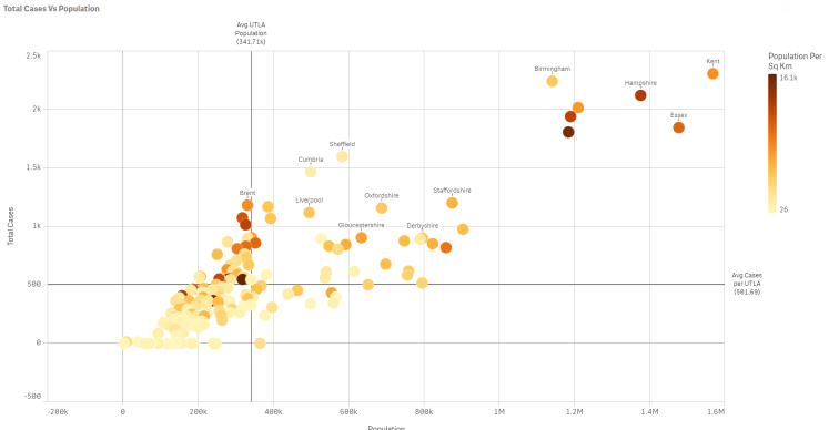
You can see big cities like Birmingham and Liverpool following the trajectory but there are some outliers like Cumbria (generally thought of as quite rural). I drew quadrants and suspected Sunderland would be in the top left quadrant; below average population for a UTLA but higher than average Covid-19 cases. To check, I lassoed the dots in that quadrant to zoom in:
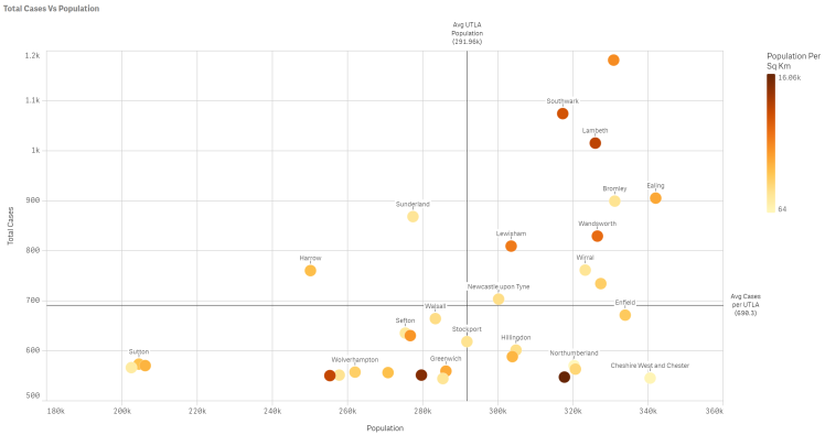
Applying the same logic to this smaller group we can see that Sunderland is an outlier even within the group, along with Harrow.
A good, old fashioned, table is perfect for checking the details:
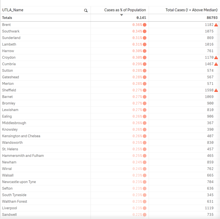
We find that Sunderland is in fact the third highest UTLA for cases as a percent of population which confirmed my suspicion.
Human intuition can get you far but when you’ve got data and a good BI tool you can start forming a convincing argument. It seems Sunderland has been impacted by Covid-19 worse than you would have expected. The maps suggest that this is true for most of the northern-most UTLAs and looking at the table we can see that only 4 of the above median UTLAs for Covid-19 cases are also ranking high for cases as a percent of population. What that suggests is open for interpretation but perhaps a high number of cases in a region acts as a trigger (or reminder) to adhere to social distancing, so in percentage terms the number is low.
Notes on the Geographic Data Preparation
The Government are producing Covid-19 data down to UTLA level but the population data I got from data.gov.uk is at lower tier local authority level. Therefore I needed to find a lookup file. Luckily http://geoportal.statistics.gov.uk had all the lookup files I needed.
The other issue was finding a KML file to describe the shapes of each UTLA. You can find these on the above website but when you load them into a BI tool you often hit issues with the “name” field – i.e. which field describes the geography (in this case the name of each UTLA). Often the “name” field defaults to a list p1, p2, p3, etc. You can try to edit the KML script in a text editor but that’s incredibly tricky if you’re not used to it. Instead, download QGIS (map building software) and load the KML file. Save the vector layer as KML and find the empty “name” field. In here, enter the field from the KML that describes your geography. You can find this by opening the KML file in notepad and looking for the field.
