The last few version of Qlik Sense have been so new feature-rich that for experienced developers it can be easy to forget about the importance of the basics – none more important than the Green, White and Grey that set Qlik apart from the competition. It’s the first thing any new user or developer should learn but what’s the best way to understand it? It recently struck me that the Green, White and Grey is a lot like a game of ‘Guess Who?’, the family classic board game. Let’s explore that idea…

When consuming data for analysis you very rarely only want to examine at the entire data set at once. You want to filter it down and interrogate it. In Excel you do this by applying filters to your columns. In SQL you use joins and WHERE statements to filter records down. With both of these tools you lose sight of data along the way; especially with SQL where you completely drop data in order to form smaller data sets for reporting. This linear approach leaves you with subsets of data and forces end users down a path on which they cannot turn around. With Qlik all the data is kept in place and whilst its associate engine guides you down the right path it also leaves a trail of breadcrumbs so you can always make your way back to the whole data set.
That guiding hand comes in the form of three colours: Green, White and Grey. When you select a value in the data it turns GREEN. That way, you can always see what filters you’ve applied and understand the choices you made. After the selection is made, all other field values will show as White or Grey. WHITE values are values that are associated with your selection. Grey values are not associated with your data. It’s these grey values that SQL leaves out but Qlik displays, because often, what’s not associated can be just as insightful as what is associated. If you were a car sales manager looking at a Qlik dashboard you might select ‘Volkswagen’ as the manufacturer and see that in the ‘Car Type’ field the value ‘4×4’ is coloured grey. You might well ask yourself ‘why are we not selling 4×4 cars?’ You might then check the stock levels figures in the dashboard and discover 4×4 cars are no longer stocked but your sales history sheet shows they were your most popular model last year. What happened? This line of questioning could not have occurred without the power of grey. Here’s what it looks like in practice:
Characters with a female gender do not have facial hair (because Conchita Wurst isn’t in the game). You may have noticed the 2 shades of grey. Lighter grey values are ‘alternatives’ in that they were available up until your last selection.

Enough with the sales pitch! We all know Green, White and Grey is what makes Qlik tick. So how can we teach it in an engaging and intuitive way? It was when I was thinking about this that I imagined playing a game of ‘Guess Who?’ The original board game is a bit like the SQL approach described above. You filter down your possibilities by asking questions and discard (or in the game terms – knock down) the characters you’ve eliminated. Once they’re down you can’t pick them back up to check if you made the right decision or accidentally knocked one down that you shouldn’t have. What if we took a Qlik approach to the game? Better still, what if we built the game in Qlik?
Here’s a quick GIF of the app (a more expansive, better quality video is at the end of this blog post).

In the Qlik version you’ll see below, not only do you get a breadcrumb trail of all the questions you asked and the answers, you get to see which characters are not associated with your answers. You can then start checking for errors like ‘why is Alfred recorded as being ginger? Isn’t he more strawberry-blonde!?’ Or maybe you want to examine the gender gap in the game (clue: there clearly is one and I bet you can guess who it’s in favour of). The green, white and grey helps you interrogate your data but most importantly lets you change path if you need to.
One last metaphor if you’ll allow me… It’s like driving down a road. Your friend is in an SQL car and you’re in your Qlik car. As you go down the road you notice something that wasn’t there before; your favourite coffee shop have opened a new store. Your friend tries to steer towards the entrance but the car won’t let him. You gently steer into the drive-thru, enjoy a nice latte and then hit road feeling happy and refreshed. That’s before we even talk about the speed of the cars but that’s for another day.
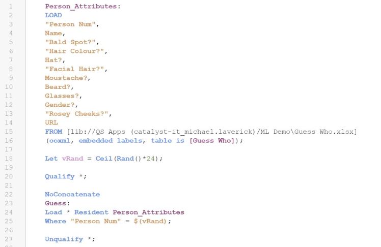
The dashboard uses the PicFlip extension to enable interactive selections with images. After creating a simple data table with the characters names and attributes I created an equally simple script to handle the data and randomly select a character for us to guess:
You don’t have to use an extension if you don’t want. I think it’s more fun having interactive pictures than one static picture.
It’s a shame Qlik don’t have a site where you can publish small, public apps but until then, why not have a go at making a version yourself? If you need want to use the extension you will have to host the images somewhere. I attached them to the Qlik Sense app and used their URL from the QMC. I added a URL field to the data with the correct url for each character’s image. You could use your own images and maybe make a version based on your work colleagues or characters from your favourite TV show. As always, leave a comment if you need any help.
