Having written a list of potential new blog articles my thoughts should have been on “which one to write up first,” but after after listening to some Billy Bragg in the evening I decided to indulge my inner socialist and write up something that wasn’t on the list. Using Qlik Sense and some VizLib charts I examined the Tories’ track record using what you might call “the Ghandi measurement.”
“The true measure of any society can be found in how it treats its most vulnerable members” – Mahatma Ghandi
Ghandi is probably as close as you can get to a secular saint, though you’d have to forget his racist opinions on South Africa, and the above quote is something that is always on my mind whenever I end up talking politics – which seems to be quite a lot since Brexit, for some reason! Can we use this quote to measure the performance of the Tories since they came to power in 2010? Well, let’s try…
A good place to start when measuring levels of vulnerability might be homelessness. I’m sure I don’t need to explain why being homeless might leave you in a vulnerable situation. Another obvious measure is unemployment rates. It seems obvious because the Tories don’t stop banging on about it. It’s their trump card in any debate on the economy or society, but it’s used to mask a lot of other, more serious, problems. Using a VizLib line chart extension (https://www.vizlib.com/#library) we can compare these two measures:
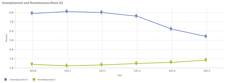
Indeed, the rate of unemployment has decreased significantly since their election. Fair play. Given their obsession with the term “working families” it’s not surprising to see that more people are in work now than at the start of their tenure. However, if you’re not a working family it would seem the government has less time for you, with rates of homelessness rising steadily since 2011. Judge a society on how it treats it’s most vulnerable and the above gives you some solid evidence.
A note on the line charts:
As I mentioned, the line charts use an extension from Vizlib. A lot of the time the out-of-the-box charts in Qlik Sense do the job but the standard line chart is one area that is lacking in options/customisation in my opinion. The Vizlib version offers options to change the thickness of the lines, the size of markers and even comes with an extensive pack of icons to use as markers.
Another key measurement of vulnerability surely has to be child poverty. All children are vulnerable to some degree but a child in poverty is denied that very basic rite that most of us take for granted – a good chance.
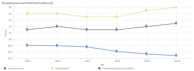
As the above chart shows, rates of child poverty have been increasing under the Tories, even children in working families. The Tory mantra of “working families” is a broken one. It’s all smoke and mirrors. It boils down to this: What is the point of having more people in employment if that employment does not pay a living wage? From here we could go on to look at zero-hours contracts and so forth but let’s end with one last chart:
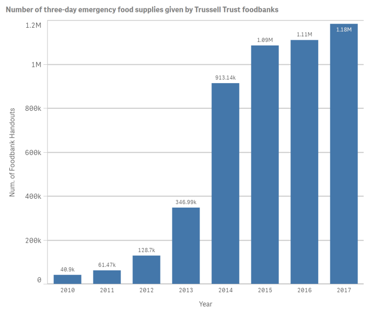
I don’t think this one needs any explanation.
In summary, every time I turn on the news and see a Tory minister giving an interview, ecstatic because the new unemployment figures have been released, I ask how those out of work are doing. I also ask how these people with new jobs are coping when the UK has experienced the second lowest growth in real term wages (just behind Greece) of all OCED countries – as the chart below from the LCE Centre for Economic Performance shows. We might be able to make a richer country by getting more people into work for global corporations who don’t pay their share of tax but we will have failed the Ghandi measurement if we do so at the expense of the most vulnerable. 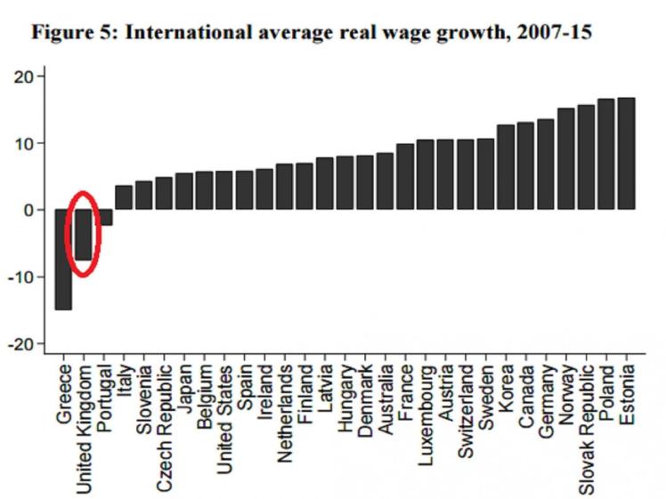
Data sources: All data from https://www.ons.gov.uk/ and https://www.gov.uk/ except for foodbank data which comes from https://www.trusselltrust.org

Further reading: https://www.google.co.uk/amp/metro.co.uk/2017/11/02/400000-children-pushed-into-poverty-by-benefit-changes-and-universal-credit-roll-out-7049382/amp/
LikeLike